Campaigns: Where Work Gets Done
UI UX
NewsCred's User Experience was awarded a maximum score of 5.0 in 'The Forrester Wave: Marketing Resource Management, Q1 2020.'
Property of NewsCred, in collaboration with Pei Chien and Anji Ismail
The problem
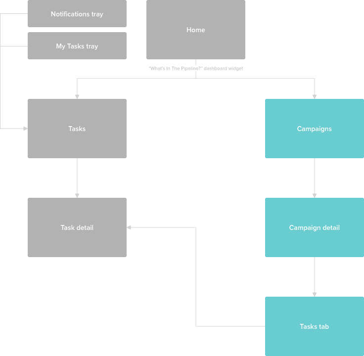
NewsCred's 'Campaigns' feature isn't only popular (it's the third most used feature in our platform), it's arguably the core of our customer experience. Campaigns contain tasks, which contain workflows, where most of our customers' work gets done. And while users spend the majority of their time in our 'Tasks' feature, nearly 50% of visits to tasks come from campaigns.
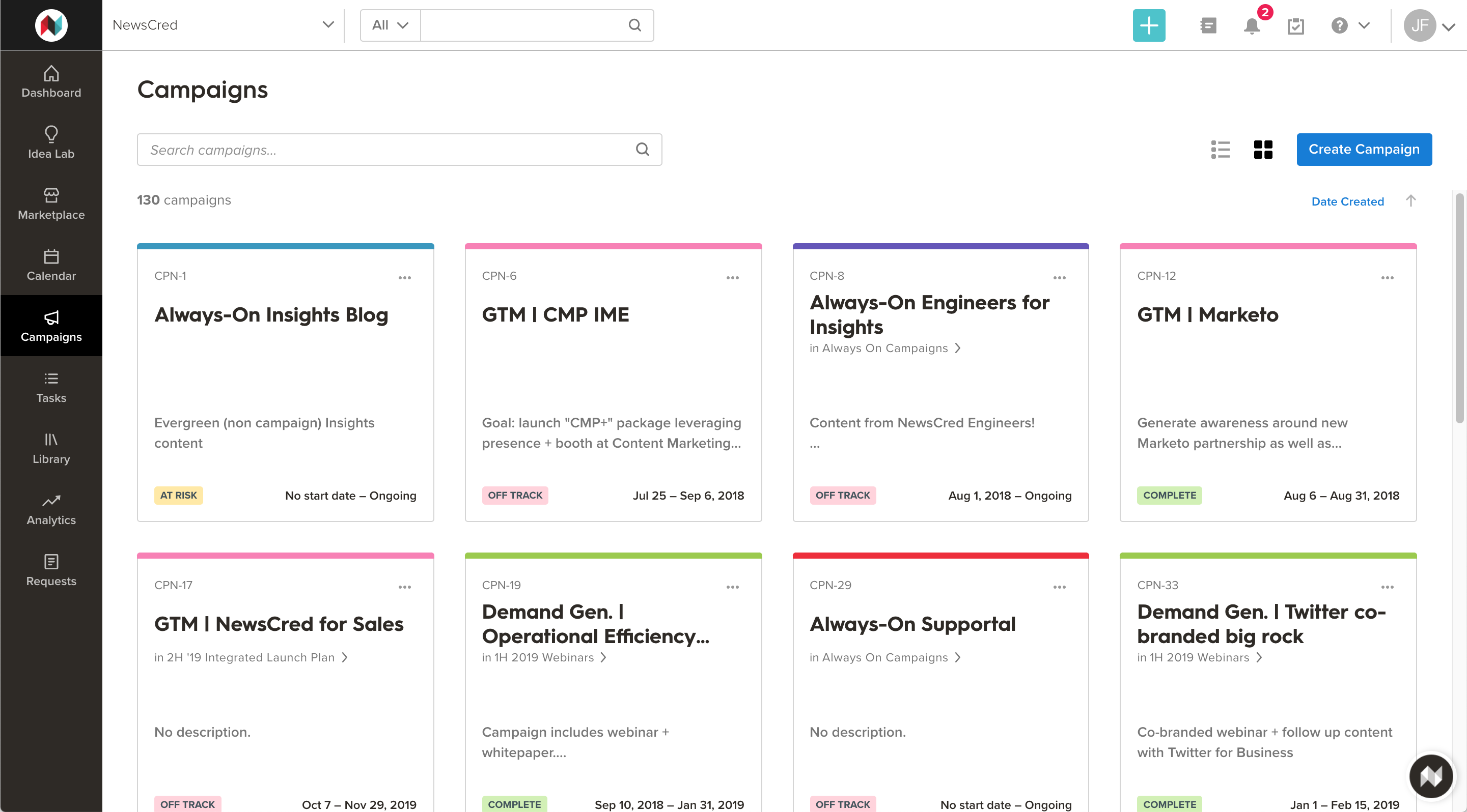
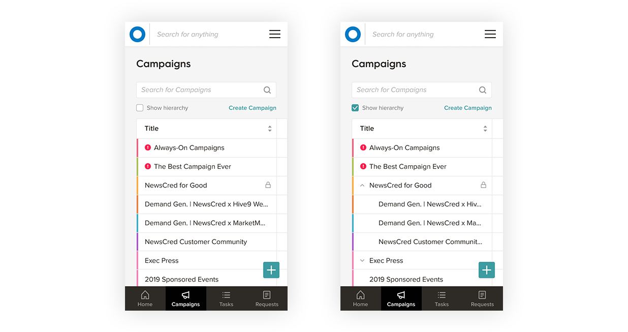
Most features in our platform have a view toggle, which allows users to display information as a gallery of cards or as a list. However, prior to the introduction of this new list view, campaigns could only be displayed in a gallery view. As we added more and more information to each card, the cards became taller and denser. As a result, users had to scroll and paginate quite a bit to see their campaigns. Some customers have over 1,000 campaigns and chose to search for campaigns because navigating them was so difficult. What's more, the gallery view had a flattened structure, and therefore didn't show relationships between campaigns (i.e. a sub-campaign was treated the same as a parent campaign).
Research and early designs
We documented some great functionality found in applications like Airtable, Google Sheets, Notion, and newcomer Monday.com, which would serve as inspirational references for our upcoming work. We also began to create wireframes and prototype flows for interactions like: adding a new object to the table (from inside and outside of the table), copying a campaign, and grouping objects by different dimensions.
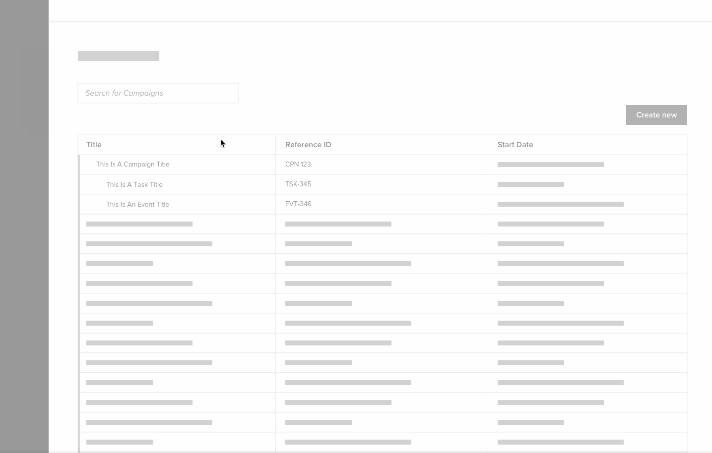
A wireframed prototype communicating a user's flow for adding a new row to the table.
Testing and iterations
We conducted remote unmoderated and remote moderated user interviews, leveraging UsabilityHub as well as joining customer calls with our Customer Success team to speak to our users directly. After providing appropriate context, we showed the new list view and asked qualitative questions like "Looking at this table, what action would you take first?", "What are you not seeing here that would help you get more work done, faster?", and "What would you expect to happen if you clicked [X]?" These questions helped us understand how useful the new view was, and the responses informed our iterations as we moved forward with additional designs.
The design team also tested features we would be working on in the coming sprints, as we continued to improve the table:
Copy campaign: as part of the rolling release, users would be able to duplicate a campaign. Since campaigns can house a ton of information — brief, description, attachments, budgets, and labels — duplicating them is much quicker than creating one from scratch, especially when users want to port over a lot of the same information or use it as a template. To understand which aspects should be copied, we simply asked "What aspects of a campaign would you expect to copy over when you duplicate a campaign?"
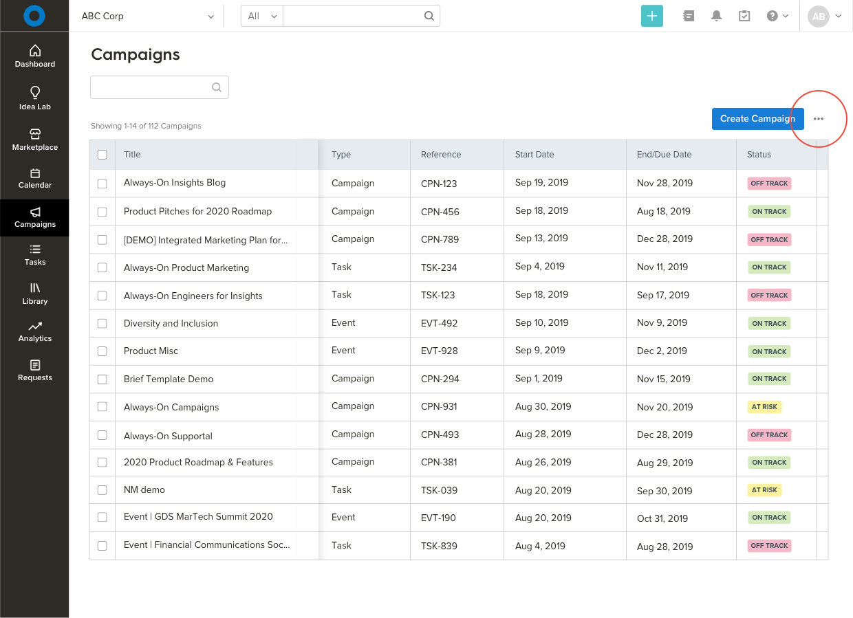
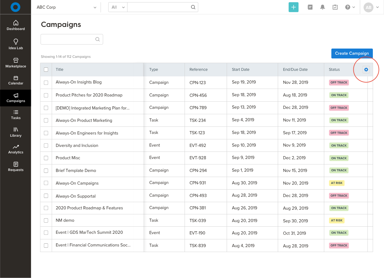
Customize columns: users would eventually have the ability to reorder columns in the table, as well as show and hide certain columns. To determine which icon best represented this action and the best location for the action, we asked "Which icon best represents 'customize columns'?" and later, "Where would you click to customize the table's columns?"
Campaign and task status: since it's important for users to complete campaigns on time, we tested a few treatments for object status to be sure users could quickly recognize the most urgent items. Our theory was that mixing colored "Overdue" and "Off-track" status badges with other badges would increase time to interaction, which turned out to be true. Using color to call out only the overdue and off-track objects allowed users to identify them more quickly.

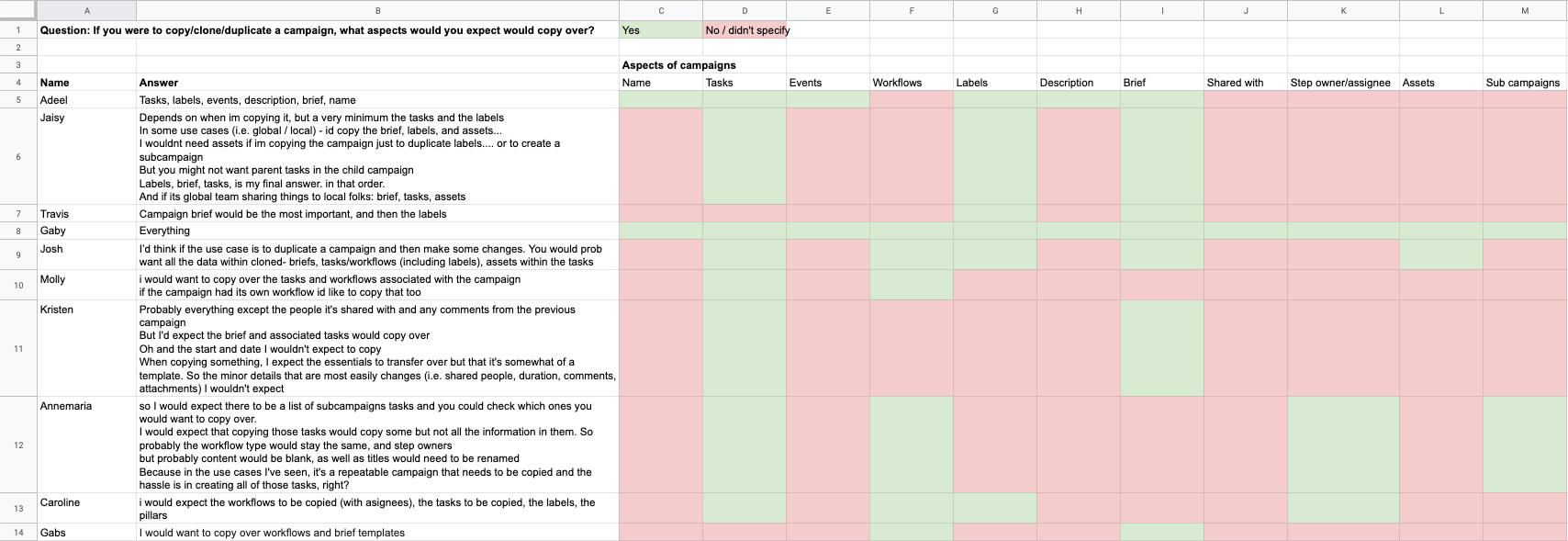
In a separate quantitative test, we asked our Customer Success and Marketing teams what aspects of a campaign they would expect to copy over when they duplicated a campaign.
The Minimum Viable Product
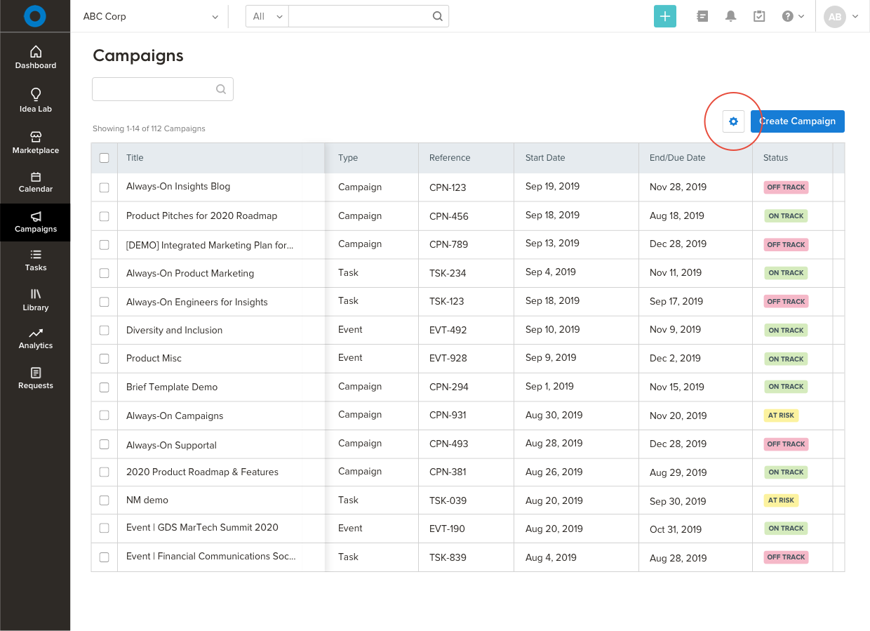
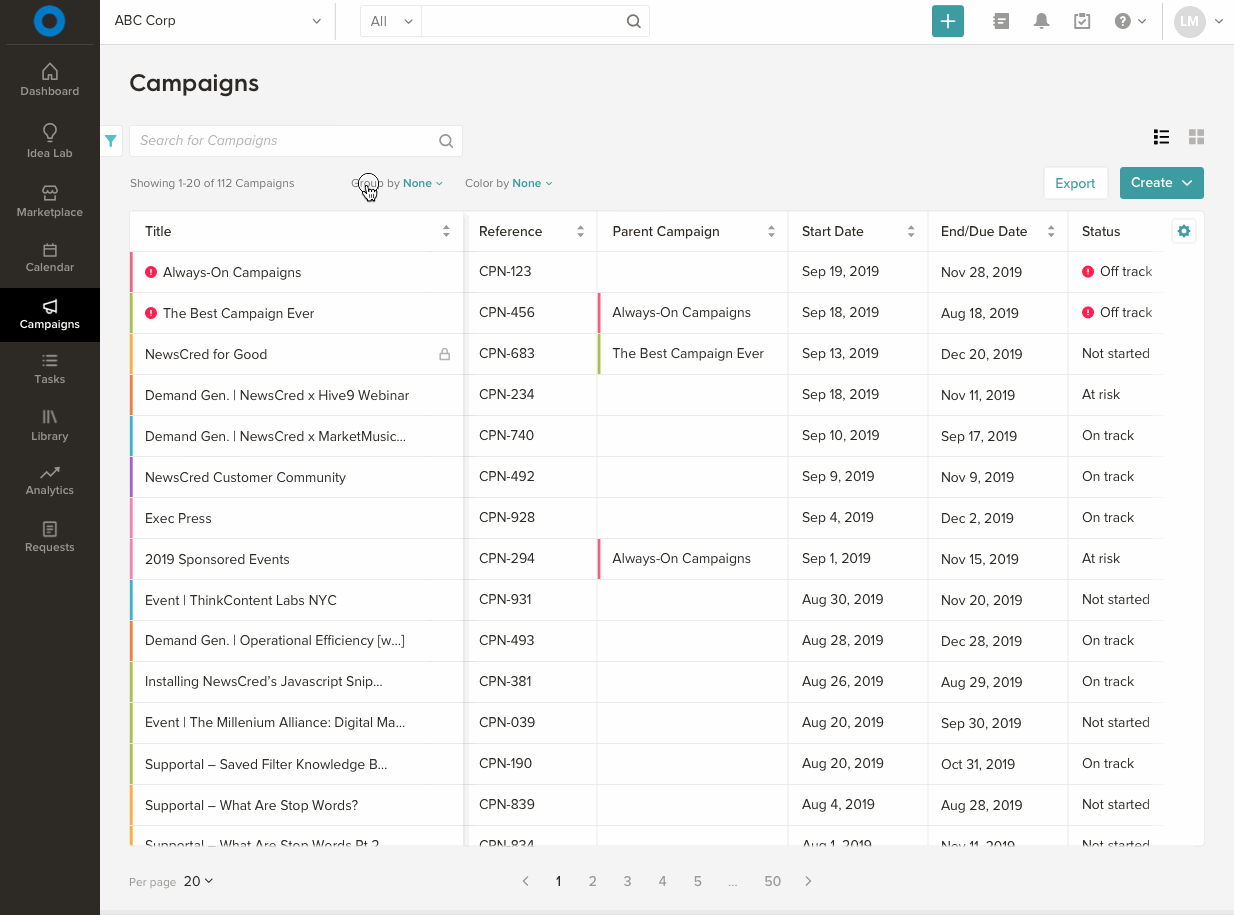
The squad decided to build upon an open source Javascript library, a robust and flexible foundation that suited our needs quite well. The end goal was a new table, known internally as the 'Campaigns list view' or 'Campaigns table', that would house all campaigns and provide users a solid understanding of the relationships between them. For the MVP, we sought to achieve parity with the gallery view but with advantages of being able to: 1) consume more campaigns at once and 2) see relationships between objects. The first iteration of the table was a flattened structure, but with a "Parent Campaign" column, where the relationships between campaigns could be visualized. This solution would be an interim state until the hierarchical view was ready a few sprints later.

MVP: A new list view with a flattened structure and column for 'Parent Campaign'.
Responsive design to support users accessing their organization's campaigns via mobile devices.
High-fidelity and results
The next iteration would see the addition of tasks, so users could see all the ingredients of their campaigns in one view. Additionally, we would roll out supplemental features on an ongoing basis: bulk actions, customize columns, add new object from inside the table, and group objects by additional dimensions like owner and assignee.
Since the beta release, adoption has continued to increase at a steady pace, proving the value of the view and serving as a testament to efforts of our Customer Success Team. Specifically, page views climbed to 1,350 per day within the first two months. We will continue to monitor adoption and behavior as we prepare for General Availability and roll out additional features over the coming weeks.
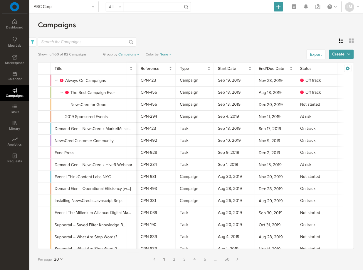
The new list view with hierarchy, showing users the relationship between their campaigns and tasks.

Changing owner for multiple objects at once, an example of bulk actions.
A user's flow for grouping objects by campaign.
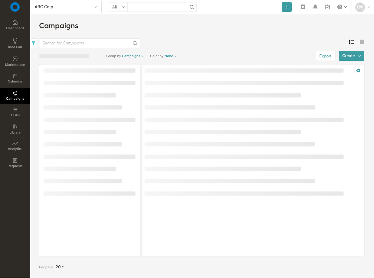
For the loading state, we built skeleton screens to reduce the amount of perceived wait time. Our engineers created these as a reusable design component that could be used in other features as well.