Anomaly Detection: proactive, reliable alerting powered by AI
UI UX
My team devised and built Anomaly Detection, a greenfield feature launched as part of a strategic, multi-channel campaign. As one of three new products under the umbrella of Honeycomb Intelligence, an AI-native observability suite for software developers, its unveiling generated early access signups from enterprise teams including Slack, Intercom, HelloFresh, and Duolingo.
Honeycomb's software is property of Hound Technology, Inc. This case study is not sponsored by Honeycomb. The information presented in this case study is derived from: social media, blog posts, documentation, press releases, and analyst reports.
The Signals Team shipped an MVP that learns service data normalcy and automatically surfaces deviations.
Problem: alert configuration was a barrier for new and existing teams, and false positives eroded trust
While Honeycomb's value was well understood by the market, my team found that friction in alert creation inhibited the realization of that value for some teams. Users like Site Reliability Engineers (SREs), whose primary motivation was to understand service health and be alerted about issues, were often confused and/or discouraged. Configuring useful alerts was complicated, as it required a deep understanding of an application's schema and the impact of nuanced user behavior on reliability.
Business opportunity
My team recognized a pivotal moment to: greatly reduce time to value (TTV) by getting started with alerts faster, reduce alert fatigue by highlighting only meaningful deviations, and lower mean time to resolution (MTTR) by enabing investigations with our complementary AI feature, Canvas. Paired with Canvas, users could investigate their anomalies without needing to write the perfect query; they could simply ask a question like, “Why are response times slower for these users?” We believed these improvements would put us in a position to increase adoption for both new and existing teams and win more deals with enterprise organizations who demanded out-of-the-box tooling.
As evidenced by Ramp.com's vendor assessment, Honeycomb's set up contributed towards its reputation as a tool best suited for advanced teams.
Solution: continuousy learn what "normal" looks like and automatically send alerts when performance deviates
We envisioned a world where Anomaly Detection eliminated long-standing friction for alert creation. By learning normal service behavior and improving over time, the algorithm would automatically detect true irregularities in signals like error rate and latency, before they impact our customers' customers. The value proposition: reduce false positives and alert fatigue for software developers.
An early vision proposed surfacing anomalies in the service selection dropdown menu on the Query page, to expedite the investigation workflow.
An early vision for an experience where users could review detected anomalies for accuracy and quickly configure their alerts.
Requirements for our MVP
Informed by a story mapping session led by our Director of Product and a proof of concept from our data consultant, the triad converged on acceptance criteria. We felt confident that this scope sufficiently balanced impact and effort to: deliver just enough value, facilitate conversations with early access users to learn what else would be needed, and not be overly demanding on our backend:
- Anomaly profiles for services would be spun up manually, and the early access teams would choose their services during onboarding.
- Deviations lasting more than 5 minutes would be considered an anomaly.
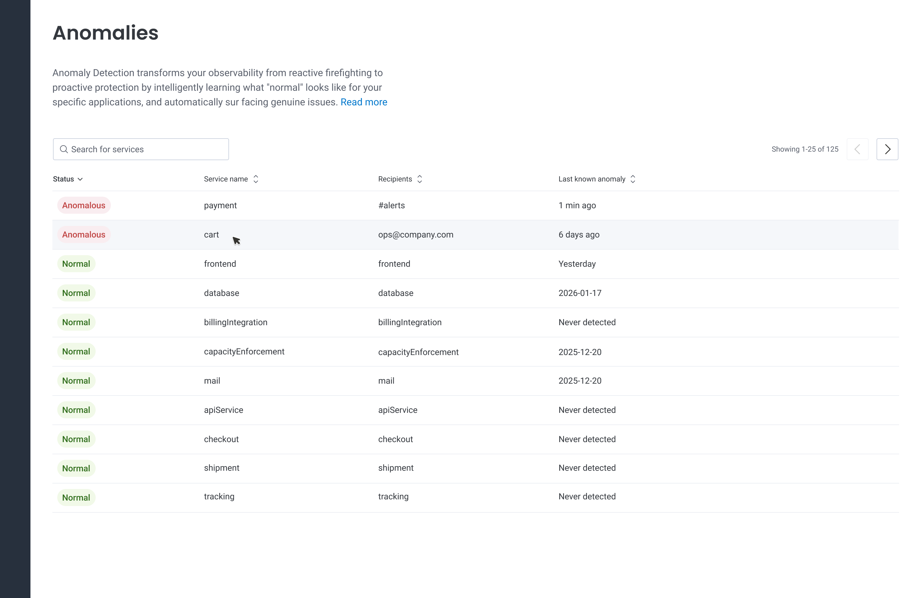
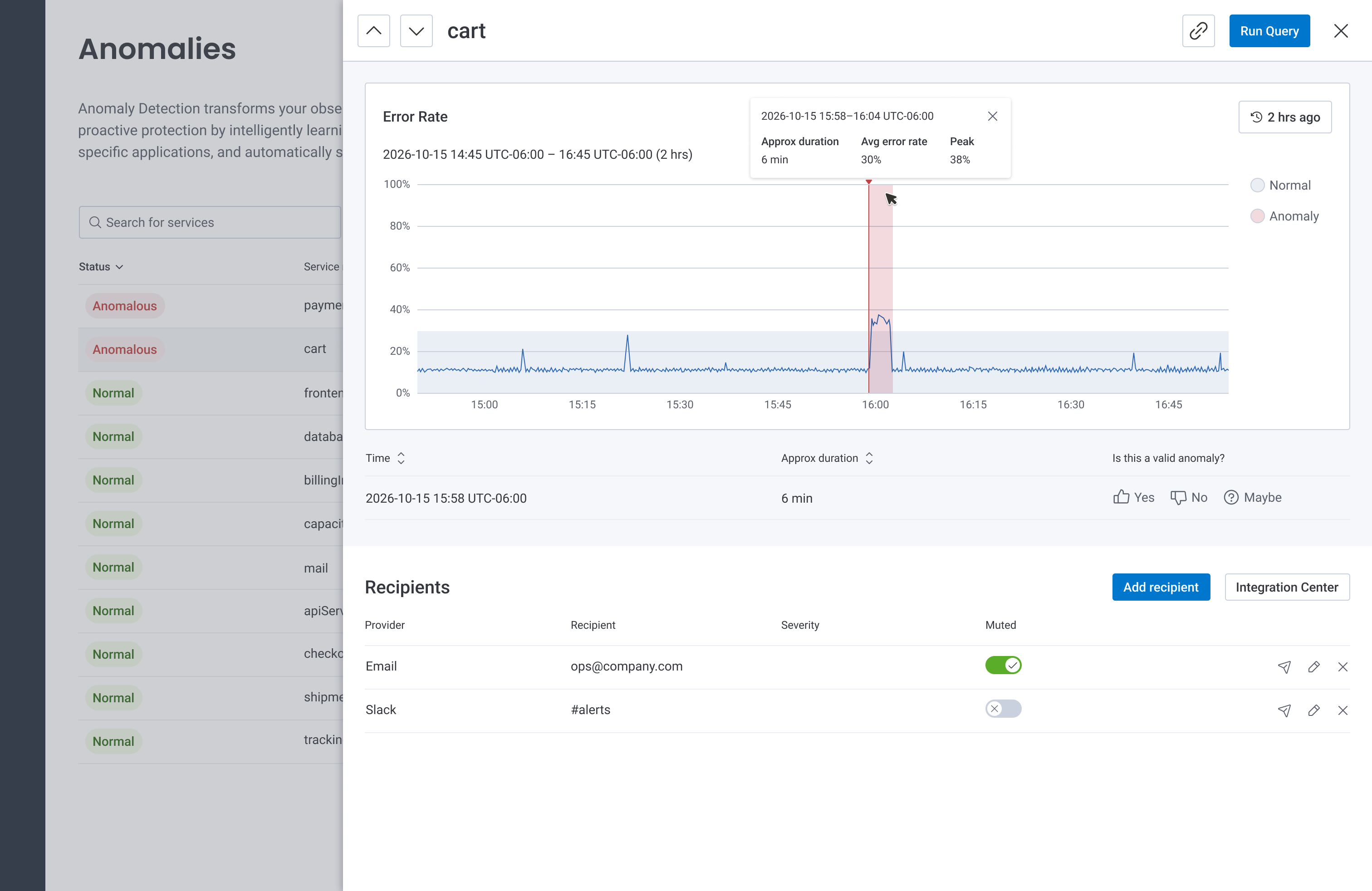
- Anomalies would be presented via two views: a list of services and their status (anomalous or normal), and a detail panel showing when anomalies occurred.
- Anomalies within a previous 2-hour window would be visualized on a graph.
- Start with the error rate signal type. Based on query data in Honeycomb, we understood this signal to be the most popular among the four golden signals.
- Enable an investigative workflow by allowing users to run a query.
- Email and Slack would be the first available notification channels; Pagerduty and Webhooks would be considered later.
Our Director of Product led a story mapping session to align the team on the user's journey, and start a discussion about acceptance criteria for the MVP and future milestones.
We planned to instrument the code to understand user engagement by analyzing quantitative data like: service list page loads, service name clicks, recipient configurations, and 'Run Query' button clicks. From a qualitative standpoint, we would partner with the Sales and Customer Success teams to understand how Anomaly Detection influenced new deals and renewals.
Flagging risks at the outset
My team discussed and documented technical and UX risks before we embarked on the project. These reminded us about specific aspects of the implementation to evaluate throughout the project lifecycle.
- Noisy alerts. A key value proposition of Anomaly Detection was to reduce false positives by providing intelligent, dynamic alerts based on genuine issues. We understood the possibility that Anomaly Detection's algorithm, which wouldn't be adjustable by the user at first, could result in noise — therefore negating the entire purpose of the feature. Our algorithm would learn and adjust on the fly to accommodate varying use cases, but it would take some time to learn what "normal" looks like. Additionally, "normal" can vary across teams in different industries, with different traffic patterns. For example, one customer in the construction sector expected little to no traffic to their app on weekends. Automatically accounting for this flavor of seasonality would be critical to not generate noisy alerts. We agreed that adoption would be heavily influenced by users' first impressions, and inaccuracies would not do us any favors.
- A disjointed workflow. Since the feature was greenfield, it was most efficient to develop it in an isolated area of the platform — accessible via its own item in our main navigation. We acknowledged the primary risk of this being a fragmented user flow. We noted the need to revisit its home in the future to integrate it into a cohesive alerting flow.
- Anomalies as another alert type. Honeycomb's alerting suite thus far consisted of Service Level Objectives (SLOs) and Triggers. Would the addition of a third alert type confuse users? Would they understand the value of Anomalies and the use cases for each alert type?
- Configuring notifications would be manual. While anomalies would automatically detected, recipients who would receive alerts would need to configured manually. Could this result in frustration?
- Statuses could be misleading. We anticipated a scenario where a service, which was recently anomalous, now read "normal." Technically, this would be accurate, but we felt some users might want additional context to understand the nuance. This sparked a discussion among the triad members about a potential third status.
Designing the experience
Sampling of early sketches to explore information hierarchy and graphing for data presence.
To reduce engineering effort and still provide a delightful experience, I proposed making use of our existing components and patterns wherever possible. This meant upcycling our list view, which was already being used for Triggers and SLOs. The previous quarter, another Product Designer contributed a drawer component to our design library, a panel that would slide in from the right over the top of a page. This panel was a great home for our anomaly detail content because it allowed the user to stay on the current page. During development, engineering ran into an issue where tool tips within the drawer didn't display. I worked with the App Enablement Team, who maintains our design library, to address this at the component level. This small investment allowed tool tips to be used in any future implementations of the drawer component, for all product teams.
In order to indicate on the graph where an anomaly begins, we repurposed functionality and styling from markers; vertical bars on our Query page that denoted deployments. We represented the "normal" range using light gray shading, and highlighted anomalous time ranges using semi-transparent red shading.
For our recipients table, where users configured destinations for their alerts (Slack, email) we decided to invest in a new pattern to quickly add, edit, remove, and test a recipient in-line, without leaving the table. Existing instances of recipients in the product required users to configure them in a modal, which we felt would detract from the user's flow. I paired with Engineering to iron out the details, and we worked with the App Enablement Team to contribute the new pattern to Honeycomb's design library. This investment empowered other product teams to use it in their own list views moving forward.
The MVP we set out to implement and test with Customer Development Partners.
The MVP we set out to implement and test with Customer Development Partners.
Specifications delivered to our engineers, which included an interaction map and implementation details for each screen.
User testing
While our mighty engineering team charged ahead with technical discovery and backend development to get our infrastructure in place, I ran on a parallel path to test the usability and comprehensibility of my designs using a clickable Figma prototype.
I partnered with our Director of Product, Product Manager (PM), and Customer Success Team to recruit Customer Development Partners (CDPs) for user interviews. My PM and I met with a handful of these external users, as well as some internal users, to learn:
- Was the information architecture clear? Was it obvious how to navigate through services?
- Was the information presented in the graph easily understood?
- What would they want to do next? Is it clear how to take that action?
- How would this experience stack up against others participants had used? What was missing?
Using Dovetail's AI summarization feature as a starting point, I synthesized the feedback into themes:
- Users wanted to understand how irregularies fit into the bigger picture; to tell a story about who is impacted and the level of severity.
- Users wondered how the feature would connect with the rest of Honeycomb.
- Users wanted to adjust the algorithm's sensitivity (common use case: seasonality).
- Users wanted to increase the time window to show anomalies beyond the previous two hours.
- Users voiced concerns about noisy alerts. They also expected "is this a valid anomaly?" to train the underlying algorithm and reduce noise over time.
- Users expected to be able to see all notification channels and recipients up front in the list view.
Data presence as a potential signal type
Alerting users about a drop in data or an absence of data was something we were particularly excited about because of its impact/effort ratio. Knowing whether events are flowing from a service is a valuable signal that can launch an investigation, and engineering estimated a relatively low level of effort to enable this.
An important nuance of data presence is that an unsustained lack of data isn't considered an anomaly. The UX challenge: how might we visually distinguish between an interruption in data that's anomalous and one that isn't? Despite its many data visualizations, Honeycomb had never needed to graph binary data. It was crucial to graph data presence in an intuitive way, since our treatment would become the standard for graphing binary data elsewhere.
To derisk, I worked with our tech lead to understand what data visualizations were supported by our charting library. With this constraint in mind, I mocked a fictitious scenario using three graph styles and posted them in a survey to our customer Slack space. We acknowledged a certain amount of bias from these responses given that many of them came from a small group of Honeycomb champions, but we felt they were still quite valuable and would increase our confidence. The feedback indicated that a categorical bar chart, where a lack of data was represented by a gap, was most intuitive (Opt A).
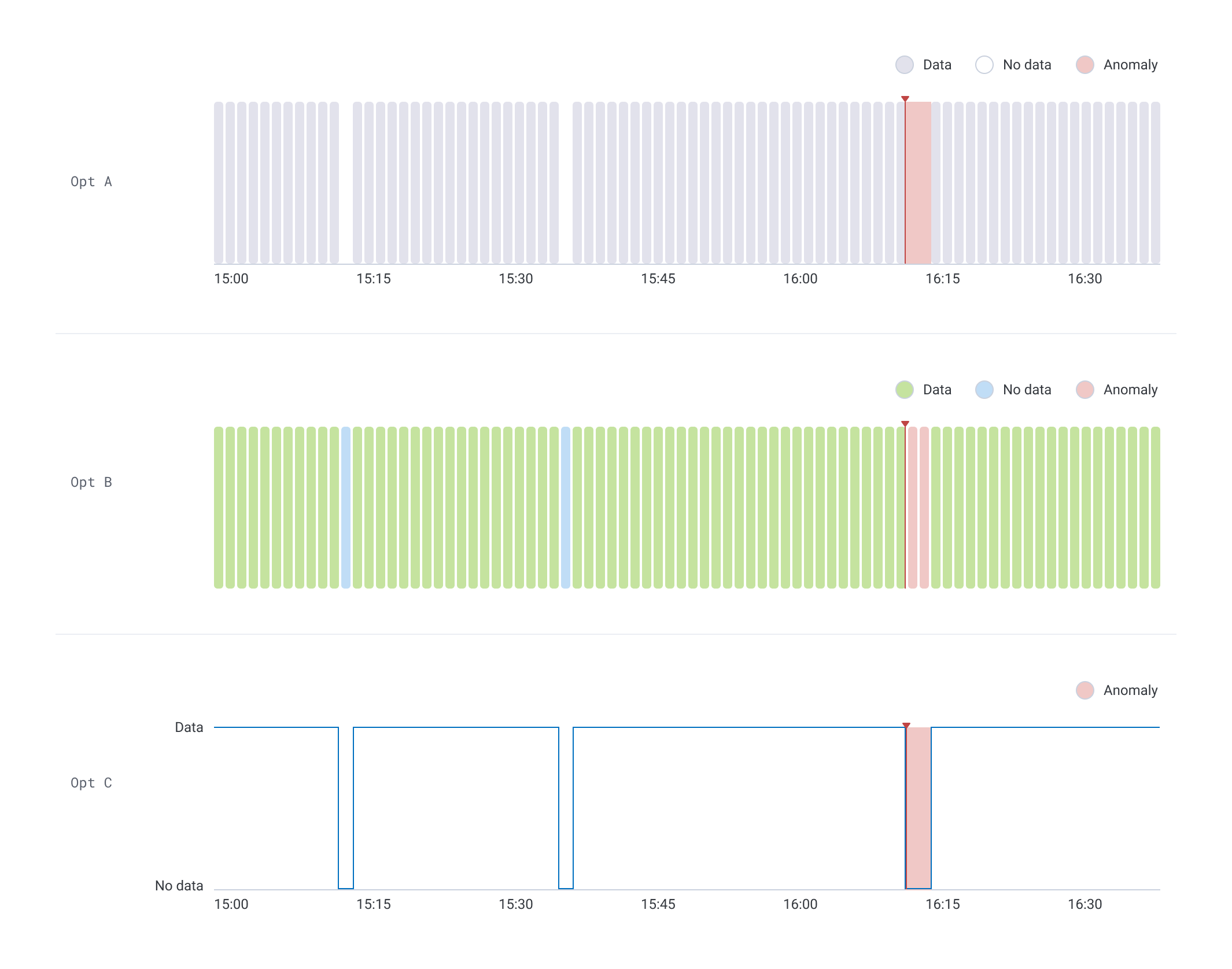
I tested chart options for the data presence signal type to derisk our data visualization.
I brought my research to the Design Team's weekly critique to get internal feedback about the styling and comprehensibility. This ensured my designs were aligned with our design library and consistent with other graphs in the product.
Launch, impact, and key learnings
Announcement of the early access release
Anomaly Detection was unveiled during a coordinated, multi-channel launch in collaboration with the Product Marketing Team. In person, it was demo'ed at Observability Day San Francisco | What's Next: The Future of Observability in the Age of AI, a live event for software developers sponsored by Amazon AWS. Digitally, it was launched via AI Week, a LinkedIn campaign that raised awareness about each component of our new AI suite, Honeycomb Intelligence. Teams signed up for the early access program in person and by contacting their Customer Success representative.
Product and marketing leaders demo'ed our Anomaly Detection MVP during AI Week, an online campaign that coincided with Observability Day.
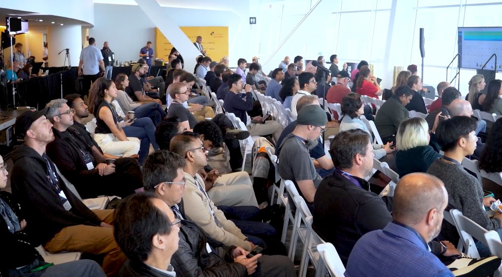
Our co-founders and Developer Relations Team demo'ed Anomaly Detection at Observability Day, an AWS-sponsored event in San Francisco that coincided with AI Week.
Reception
The announcement reiterated interest in the feature and generated positive sentiment. Beyond the sign-ups, we captured feedback from DevOps professionals who posted on LinkedIn and wrote about Honeycomb Intelligence in various articles:
Takeaways
Time will tell how Anomaly Detection influences MTTR, sales, and adoption. Ongoing analysis of quantitative data combined with user interviews will help evaluate its effectiveness and inform future milestones. Reflecting on the project, a couple learnings come to mind:
- The one-two punch of Observability Day and AI Week yielded more sign-ups than we were able to accommodate (a good problem to have!), given the overhead of manually onboarding teams' services during the early access phase. This was certainly not detrimental to the project, but additional usage would have provided more, helpful user data about our MVP's capabilities and usability.
- Despite the enthusiasm expressed by so many teams during the early access phase, we were surprised to see low and slow adoption over the remainder of the quarter. We believed these delays were a symptom of poor timing — the latter of half of Q4 is a challenging time given the holidays and competing end-of-year priorities like OKRs, reporting, and planning.